BeYou
Who
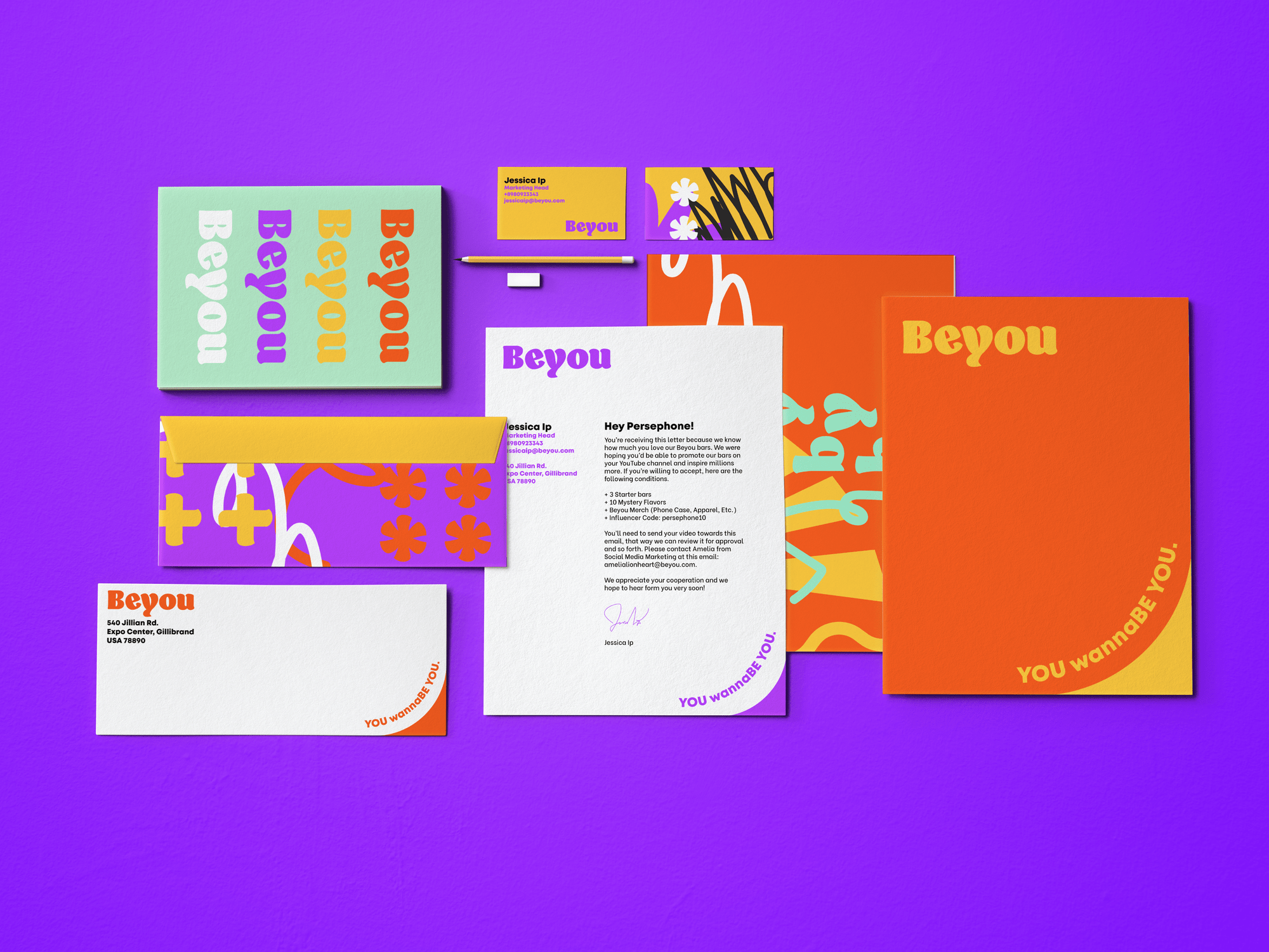
Deliverables
Timeline
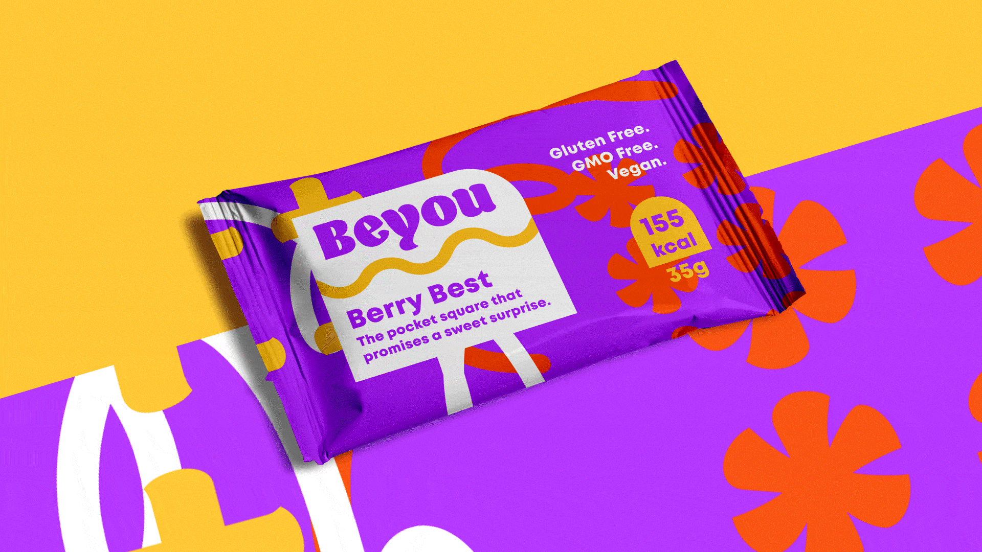
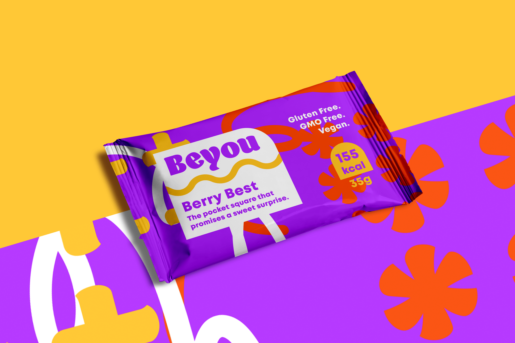
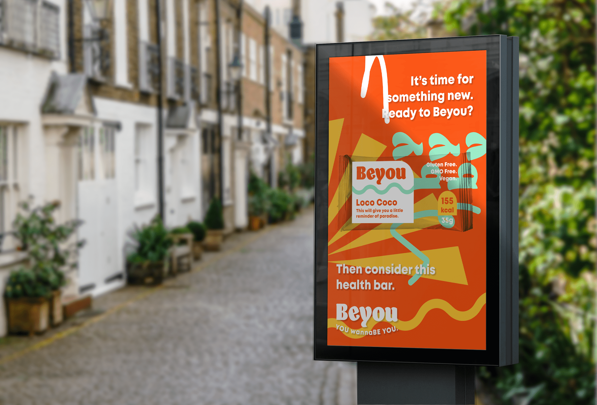
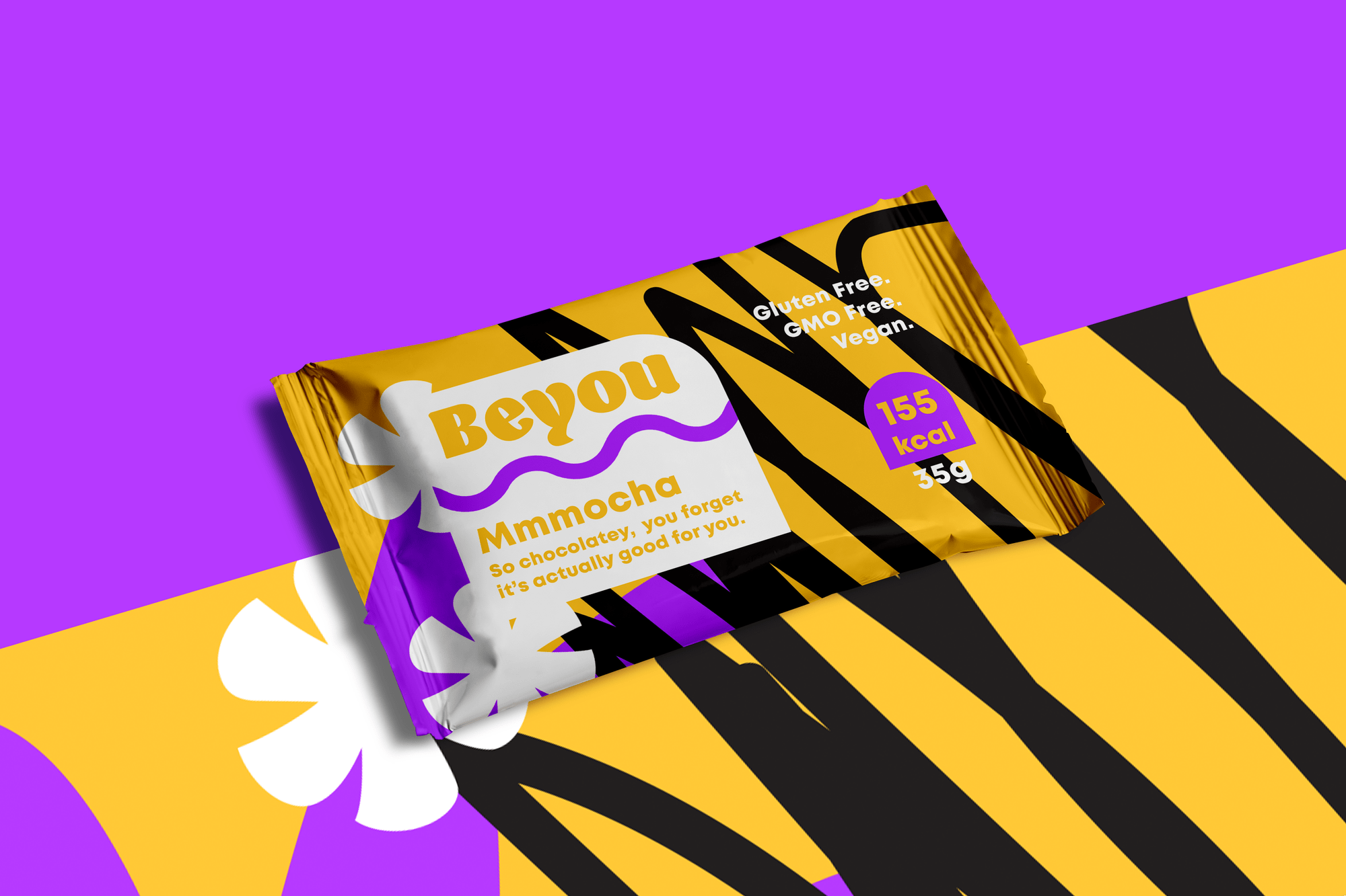
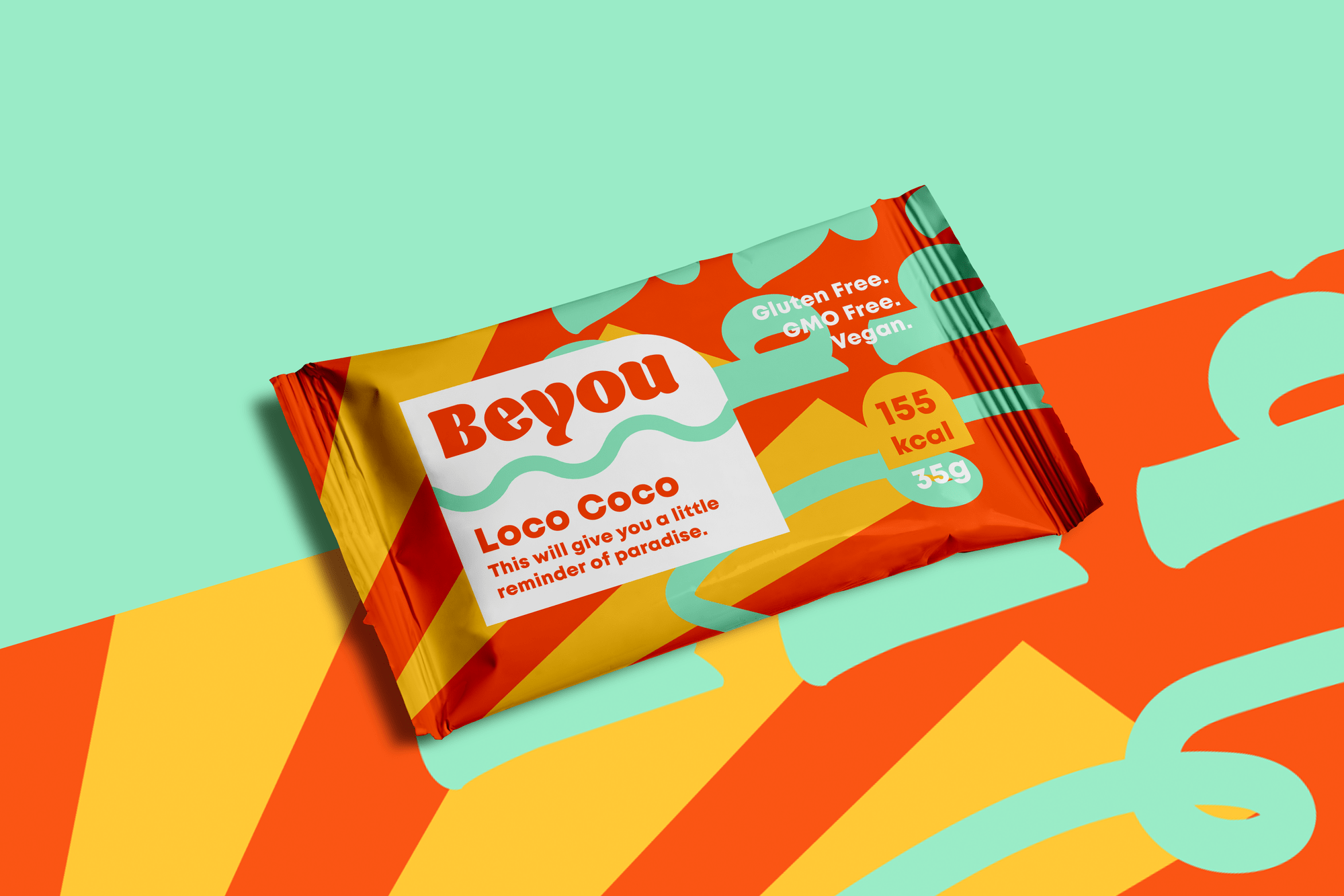
Beyou is a health bar aimed at “millennial femmes on the move” created to fulfill an “active, vibrant, fun, and social” vibe encouraging quirky consumers to engage with bright and bold design elements. Considering the brief and my personal aesthetic preferences, I transformed the brief into my own with creative copy and playfulness. This project was featured on Briefbox’s homepage on September 9, 2020.
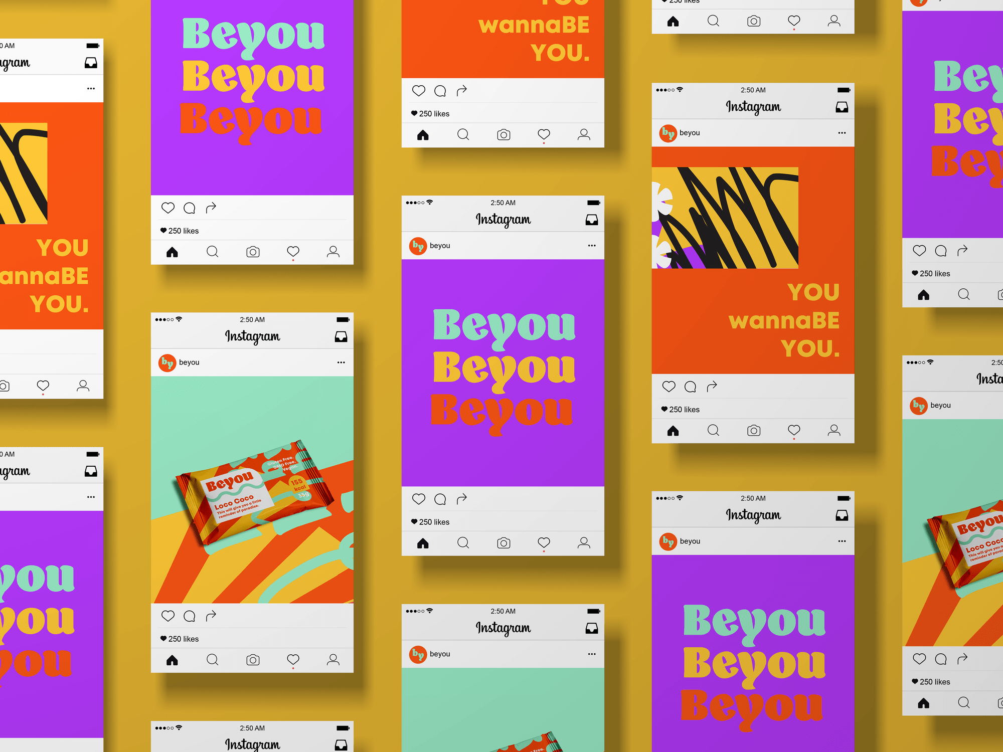
Boogie for You
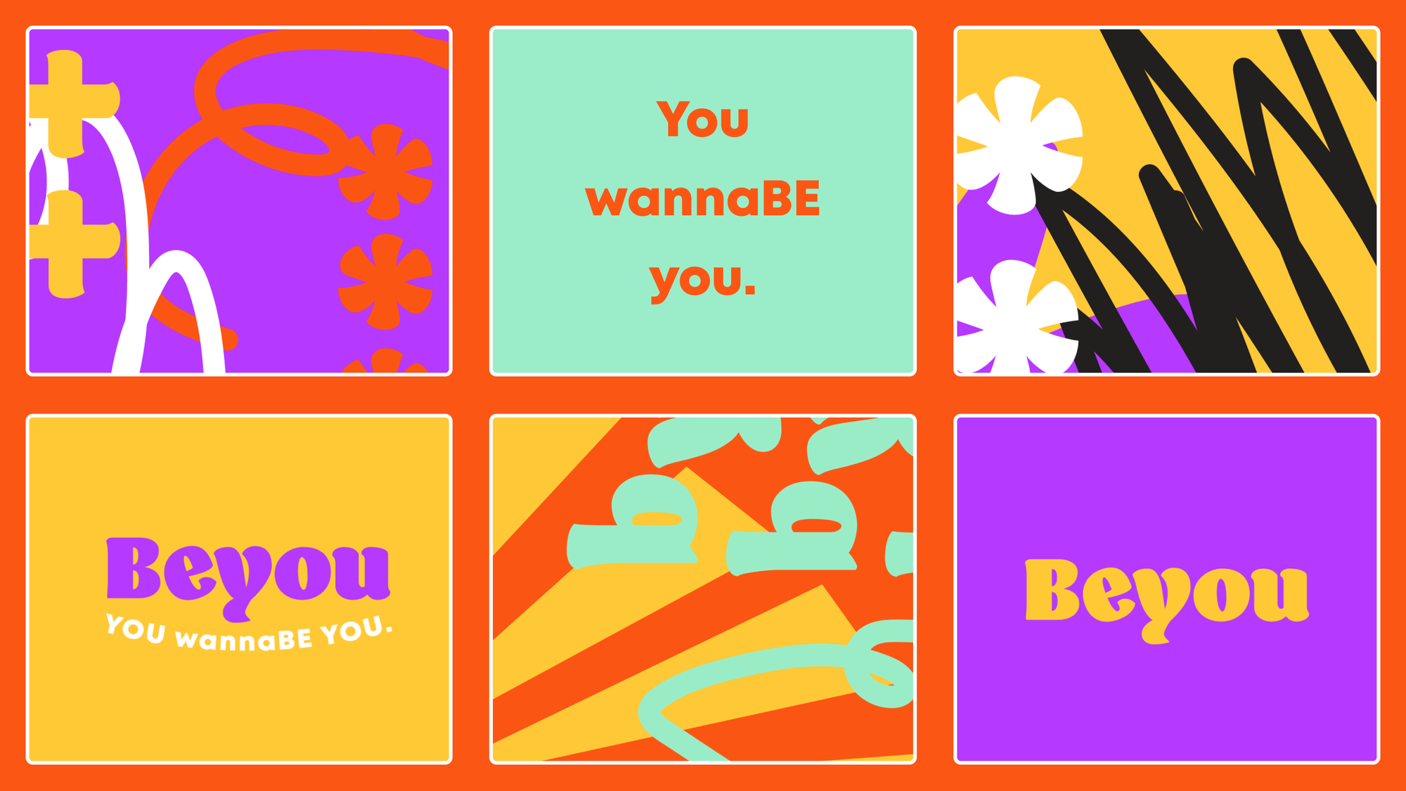
With the expectation of many deliverables within a short turnaround, it was important I had a strong visual sense and had referred to the moodboard to get a sense of what did they have in common. Just as the brief stated, bright and bold.
All of the images also happened to have a grooviness to them, with wavy lines, and seventies inspired typography and imagery. It’s the kind of vibe that makes people want to get up and dance. And I wanted to push that theme forward with the effortless and jovial feelings the sensational 70s gave.
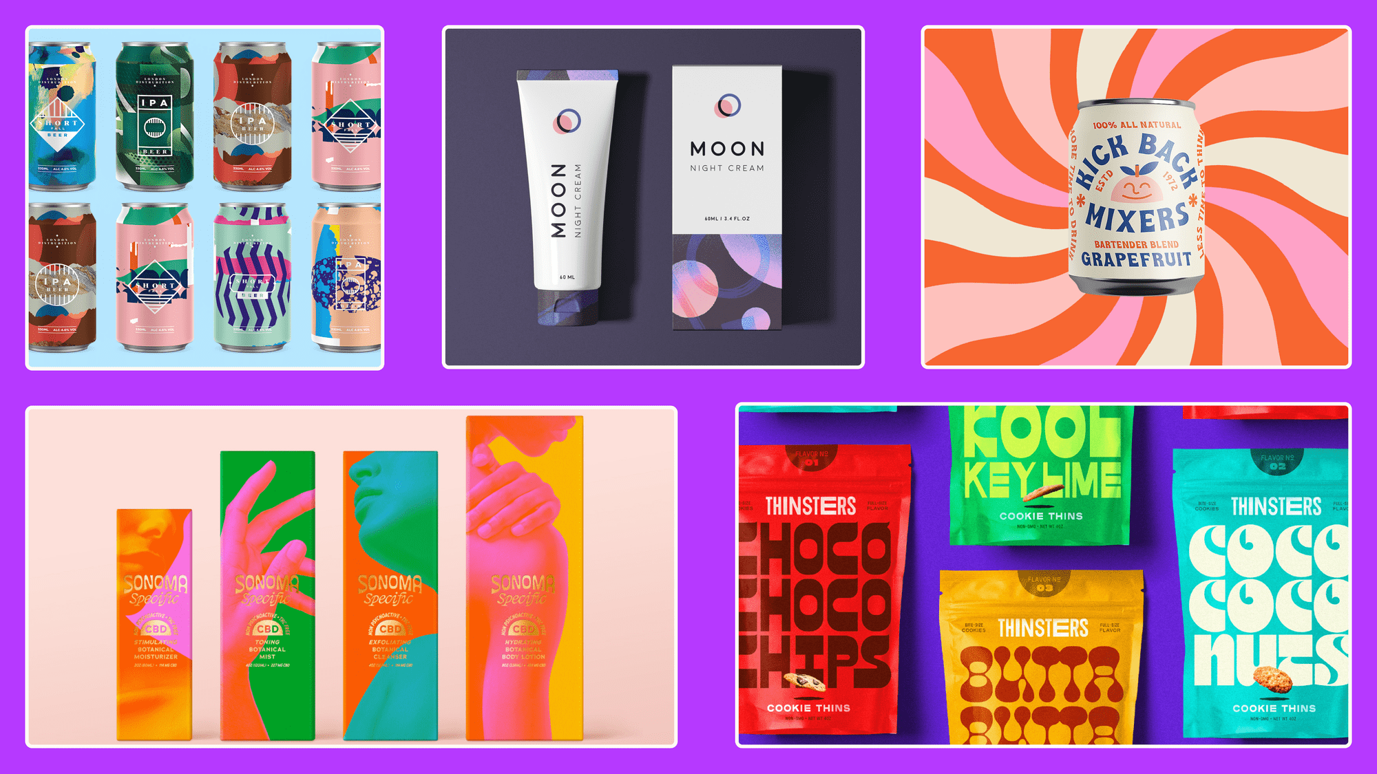
The brief included a mentor’s interpretation utilizing cool pastel colors, but I wanted to really go “far-out” in my theme and decided something big, with lots of character could get the job done.
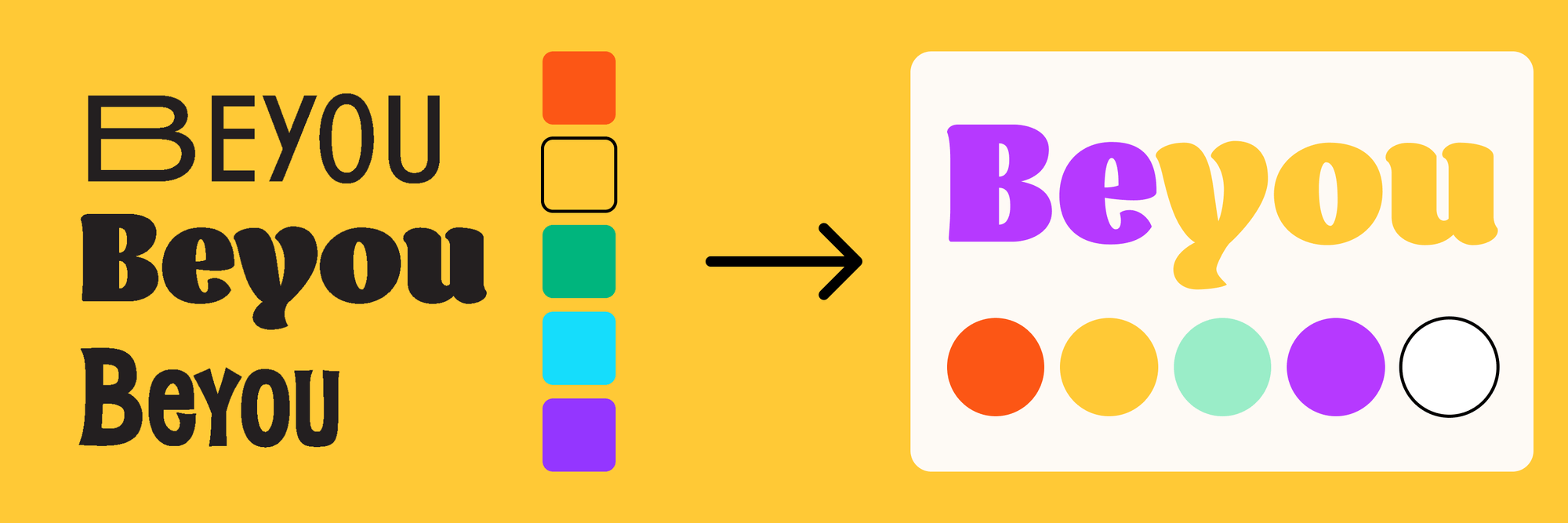
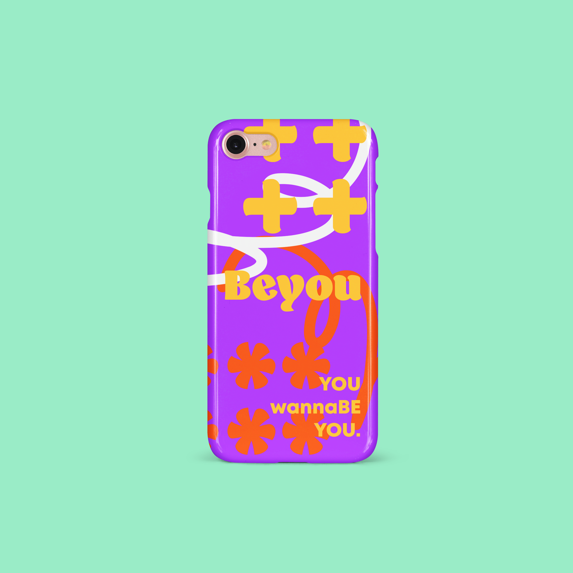
The colors were chosen from this mood board, but I didn't want it to be a basic rainbow. Instead, I added a pastel turquoise to offset the palette with strong and warm feminine red, purple, and yellow.
Legibility Issues
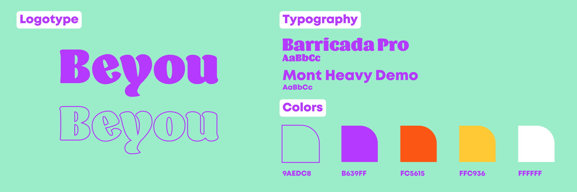
And while the message focuses on being one’s best self — I decided it was best to focus that energy via copywriting instead of sacrificing the logotype message for clarity and accessibility. As a result, I adjusted the letter “e” to rotate -20° so the company name can still be read visually without sacrificing the color contrast.
I was able to further support this effort through creative copy that would permit breaking up the text based on case-sensitive phrasing like “wannaBE”, as inspired by Itzy’s Wannabe, which was released during this time.
Final Deliverables
Lessons Learned
- While one solution may look better (subjectively), it’s not perfect for everyone.
- Yes, you can have fun with a project. Especially, if the brief permits it.
Arguably, there are in fact many things I would change to it a few years later. While I do have purple and yellow as high contrast colors, there are no real dark-darks other than the black that made an appearance in one of the patterns.
I think I would change the color palette, and have run it through a WCAG color contrast checker, despite the brief suggesting vibrancy and bold colorways and patterns. A lot of the actual copy on the product and throughout isn’t fully readable and I know that now as a much more seasoned designer.